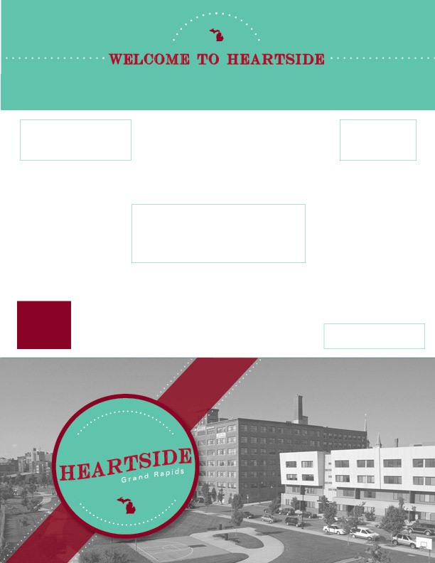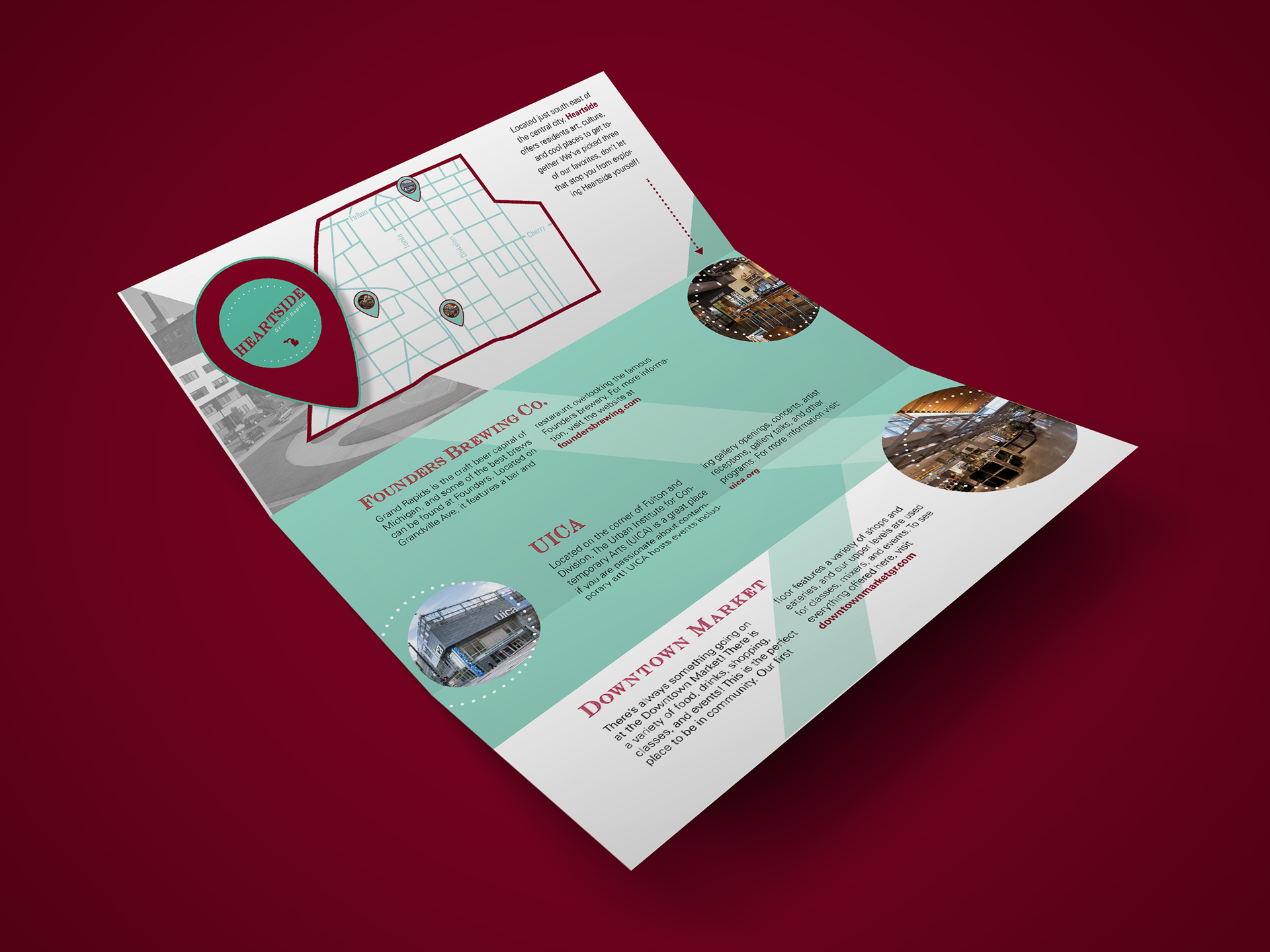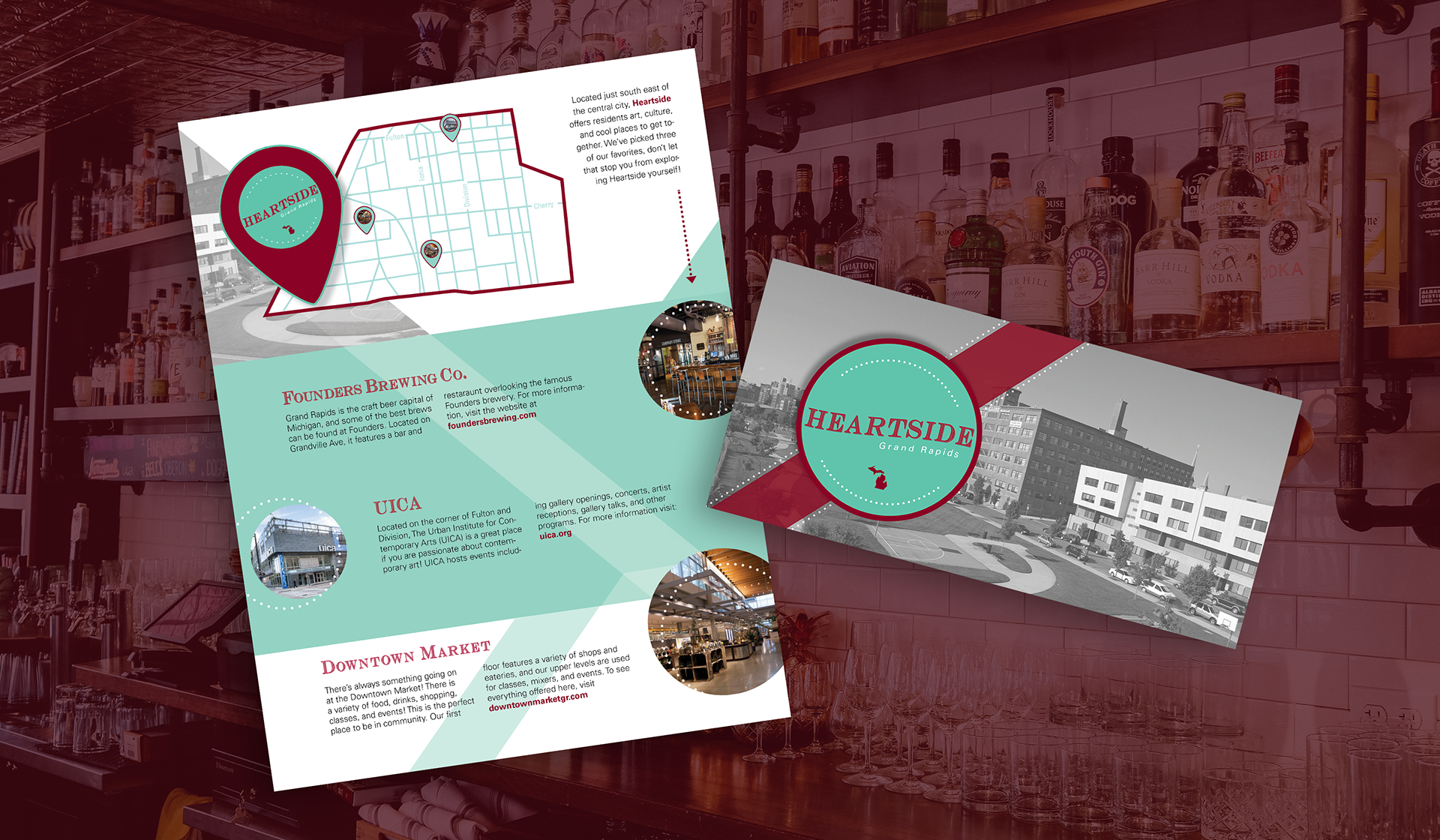
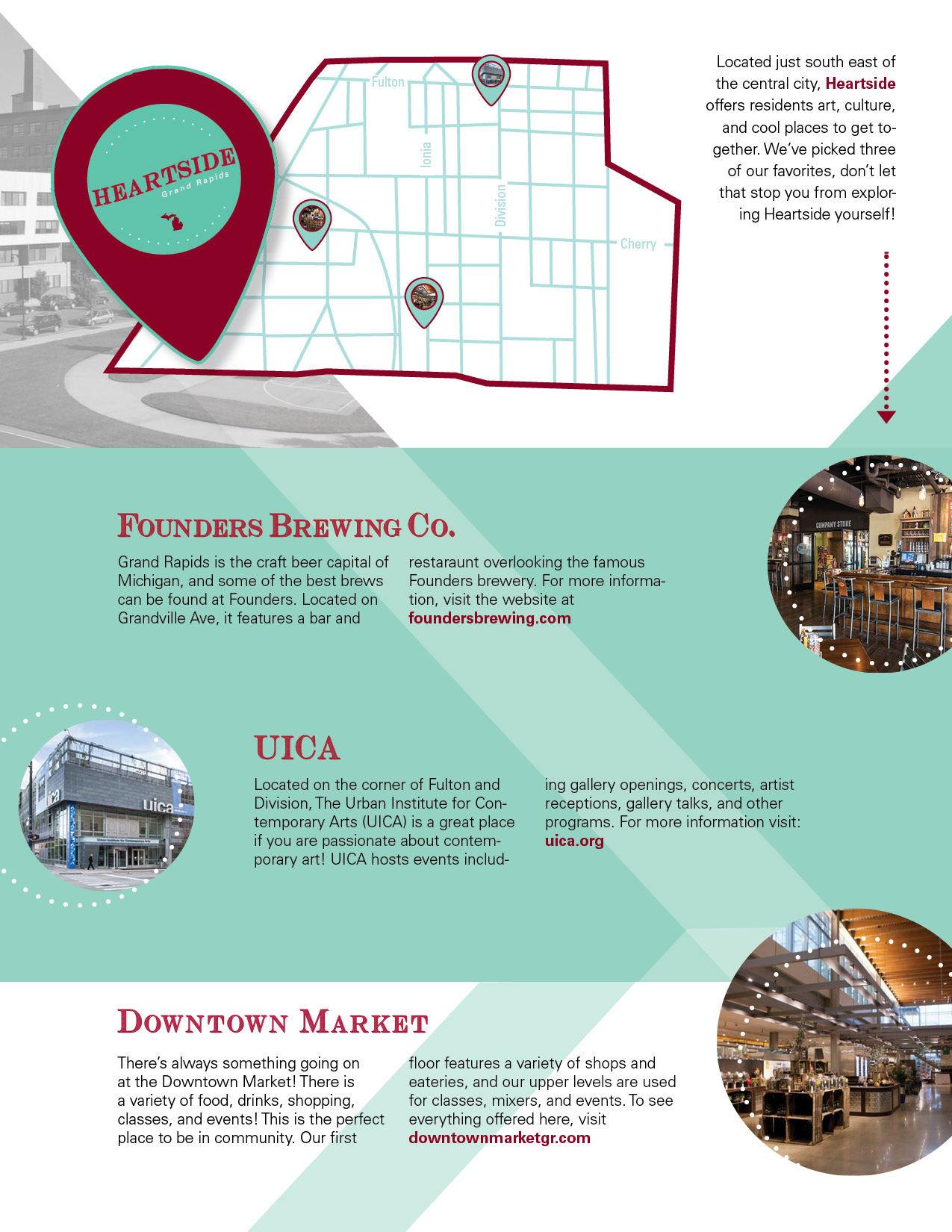
This project was to design a direct mailer for a Grand Rapids neighborhood. The goal was to encourage people to visit and move downtown. I chose Heartside, because it is one of my favorite parts of downtown Grand Rapids. I highlighted three points of interest: An art museum, a brewery, and a market. I wanted to show potential visitors that Heartside has diverse and interesting places. The colours and retro-inspired design were a marriage of the old and new Heartside. The serif typeface represents the old presence still downtown, and the colours represent the modernity and trendiness of the area.